12/28/04 10:06 - ID#30034
Resizing Photos for Upload using GIMP
 .
. The gimp is great. It is just like photoshop, looks very similar but costs nothing - not to mention it runs on every opertaing system. Mac and Linux users can follow the instructions at
 install GIMP or perhaps some mac or linux users of the site can post more detailed links and instructions in this journal entry. It will eventually be moved to the help files.
Here are the instructions to get the most current version (2.2) installed on windows.
1. Download GTK -

2. Download GIMP -

3. decompress (unzip) both files and run both installers. Make sure to install GTK first.
4. launch gimp and accept the license, keep clicking continue till the dialogues go away.
Here are the steps to resize an image using GIMP which will work with any operating system.
1. Once GIMP is running choose file-> open from the gimp menu and browse your computer to find your image.
2. At the bottom of the window where your picture opens find the drop down menu with percentages, click and make sure it is at 100% so that you can see your image at its true size.
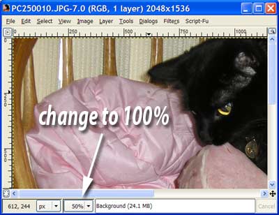
3. Next to resize your image, select "scale image" from the "image" menu.
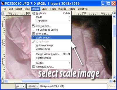
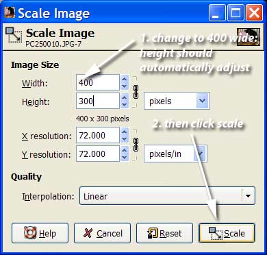
4. In the pop up window you can now set the height and width of your image. The journal cannot have images above 400px wide so you might as well set the width to 400. The height should automatically adjust. If not make sure to click the little chain betwen then. Then click the "scale" button
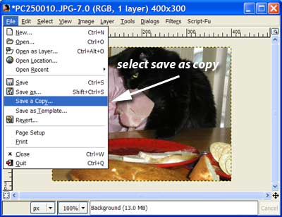
5. Last you have to save the file. Choose "save a copy" from the file menu. from there give the file a name make sure it has the". jpg" extension you started with and hit save.
6. Now a little box pops up asking you about the quality you want. the higher quality the bigger the file and the longer it takes for people to load on the web. Generally you want as small a file as possible without it looking shitty. If you click the "Show preview in image window" box you can see how the image looks at the current quality level and ajust it to be as small as possible without looking bad. Generally under 30k is good.
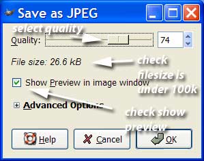
7. hit OK, after you do this you will have have a new resized image saved to your computer. now upload that image to your journal and you should have no problems.
Additional Notes: The GIMP is a full image editing program with hundred of tools and features. feel free to experiement with it. An easy tool to use is the paintbrush.. It looks just like a paintbrush and lets you paint on your image before you save it. Once I get the help system going I will add lots of other tutorials like this with video.
If anyone needs help with this feel free to contact (e:paul).
>>Posted By: paul >>Updated By: paul 12/28/04 21:53 >>Updated By: paul 12/28/04 21:54 >>Updated By: news 12/28/04 22:01
Permalink: Resizing_Photos_for_Upload_using_GIMP.html
Words: 575
Location: Buffalo, NY
12/28/04 02:19 - ID#30033
Estrip banners


and the original default face.

>>Posted By: paul >>Updated By: paul 12/28/04 13:20
Permalink: Estrip_banners.html
Words: 34
Location: Buffalo, NY
12/25/04 01:01 - ID#30032
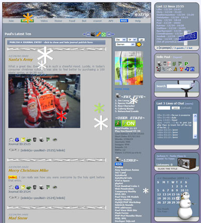
Winter Colors 2004

>>Posted By: paul
Permalink: Winter_Colors_2004.html
Words: 94
Location: Buffalo, NY
12/20/04 08:29 - ID#30031
New Draggable interface
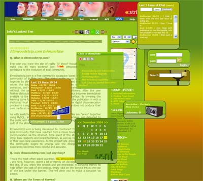
The navigational module allows you to explore a page without really have to scroll very much. It works with both scroll and no srcoll mode, both of which can be toggled from the nav box itself.
Almost all of the modules to the right are also draggable now, so bring them with you if you want.
>>Posted By: paul
Permalink: New_Draggable_interface.html
Words: 99
Location: Buffalo, NY
12/18/04 05:28 - ID#30030
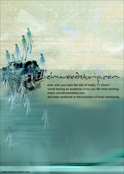
Completed Elmwoodstrip.Com Poster.
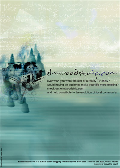
You guys can download and print it out. Click here->

Here is the completed version. Paul and I went to Kinko's to print it out.
It looks fine. Hum.. I like it a lot.. yea. yea. yea I made it.. that's why.
Soyeon.
PS: I forgot to mention that I used Ajay's Ozon picture as the background pattern little bit. Well, Ajay, you can't even tell where it is.. but there is actually. ;)
Find it out, or ask Paul.. he knows where it is exactly.
>>Posted By: soyeon >>Updated By: soyeon 12/18/04 05:04 >>Updated By: soyeon 12/18/04 06:19
Permalink: Completed_Elmwoodstrip_Com_Poster_.html
Words: 161
Location: Buffalo, NY
12/17/04 07:50 - ID#30029
Elmwoodstrip.com Poster.
Just want to know what you think.. this is smaller version.
Let me know.. I'm going to bed right now.
Soyeon.
PS: I've just checked it with my PC.. the color is little weird with PC.
Mac is the way better. Just wanted to let you know there is a differency.
>>Posted By: soyeon >>Updated By: soyeon 12/17/04 07:03
Permalink: Elmwoodstrip_com_Poster_.html
Words: 72
Location: Buffalo, NY
12/16/04 08:16 - ID#30028
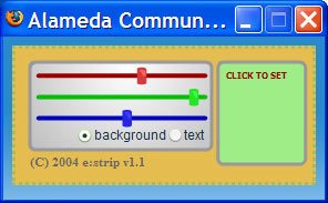
Updated Color Picker
Here is what it looks like, although this one is from estripwest so the background colors are a little different.
>>Posted By: paul
Permalink: Updated_Color_Picker.html
Words: 84
Location: Buffalo, NY
12/15/04 03:13 - ID#30027
Latest Entries Update
>>Posted By: paul
Permalink: Latest_Entries_Update.html
Words: 45
Location: Buffalo, NY
12/09/04 06:12 - ID#30026
API update
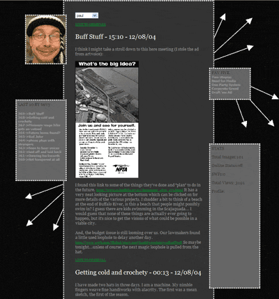
(e:soyeon) , this is totally for you. Here
 is an example page I made at my globat space using the API. It is not hard to use. (e:twisted) is also using th API for a site of her's. If anyone has questions about this please email me.
>>Posted By: paul
Permalink: API_update.html
Words: 141
Location: Buffalo, NY
12/04/04 04:26 - ID#30025
Improved Navigation and Gallery Mode
The <--10 and --> arrows go back and forth, ten journals at a time. The camera switches to gallery mode. Gallery mode allows the user to view the journal as just images. If you click on any of the images, it takes you to the entry that it was contained within. From there you can use the <--10 and 10--> arrows to move around. At any point when using the gallery function you can switch back to journal mode, by clicking on the red x camera icon or by switching journals.
I also update dthe email the user page. I moved the link to right under the user pic so that it was easy to find as requested. The link also opens in a popup box and closes when you click send mail.

By the way I love my new camera icon. I hope you enjoy it just as much I do, you can thank Cinema 4D ver 9, it was the last usage before permanent my switch to maya. I will be adding a help link with a searchable help index in place of the old gallery link in the main bar. It is not complete, but the link is already there.
I also added a new icon for the preferences. All of the control panels hav been redone and open in little popUp control panel windows. This is the new preferences icon. It is very tiny in the control panel and replaces the old # icon.

>>Posted By: paul >>Updated By: paul 12/04/04 05:14
Permalink: Improved_Navigation_and_Gallery_Mode.html
Words: 302
Location: Buffalo, NY
Author Info
Date Cloud
- 09/15
- 01/15
- 12/13
- 11/13
- 12/12
- 10/12
- 06/12
- 05/12
- 04/12
- 02/12
- 12/11
- 10/11
- 07/11
- 04/11
- 01/11
- 12/10
- 11/10
- 10/10
- 08/10
- 06/10
- 04/10
- 12/09
- 05/09
- 03/09
- 12/08
- 11/08
- 10/08
- 09/08
- 07/08
- 06/08
- 04/08
- 03/08
- 02/08
- 01/08
- 12/07
- 11/07
- 10/07
- 09/07
- 08/07
- 07/07
- 06/07
- 05/07
- 04/07
- 03/07
- 02/07
- 01/07
- 12/06
- 10/06
- 09/06
- 08/06
- 07/06
- 06/06
- 05/06
- 04/06
- 03/06
- 02/06
- 01/06
- 12/05
- 11/05
- 10/05
- 09/05
- 08/05
- 07/05
- 06/05
- 05/05
- 04/05
- 03/05
- 02/05
- 01/05
- 12/04
- 11/04
- 10/04
- 09/04
- 08/04
- 07/04
- 06/04
- 05/04
- 04/04
- 03/04
- 02/04
- 01/04
- 12/03
- 11/03
- 10/03
- 09/03
- 07/03
- 06/03
- 05/03
Category Cloud
More Entries
After This
My Fav Posts
- This user has zero favorite blogs selected ;(

 mobile

