02/22/08 03:30 - 28ºF - ID#43429
ad ideas


A couple ideas for Paul
Permalink: ad_ideas.html
Words: 9
Location: Snyder, NY
02/12/08 01:49 - 19ºF - ID#43300
Wifi lunch update
Permalink: Wifi_lunch_update.html
Words: 59
Location: Snyder, NY
01/30/08 06:03 - 20ºF - ID#43099
Email clients
One thing I hate about tbird is the way it doesn't soft-wrap replies; i.e., if I reply to someone's email the quoted email scrolls sideways.
Permalink: Email_clients.html
Words: 64
Location: Snyder, NY
01/15/08 02:09 - 31ºF - ID#42892
wireless woes
Like an idiot I ordered lunch before asking the worker. His answer was "you can go up by the windows and try to piggyback on someone else's signal". Yeah... bad Karma but they were all locked up anyway.
There should be a list of local eateries/hotspot status somewhere...if not, anyone wanna help me build one?
Permalink: wireless_woes.html
Words: 81
Location: Snyder, NY
11/06/07 10:26 - 39ºF - ID#42017
What color is the past?
Arggh! Yellow?
Permalink: What_color_is_the_past_.html
Words: 88
Location: Snyder, NY
10/13/07 12:06 - 45ºF - ID#41621
itunes madness
I bought the fucking song, let me listen to it whenever and however I want.
Permalink: itunes_madness.html
Words: 47
Location: Snyder, NY
10/09/07 07:58 - 65ºF - ID#41564
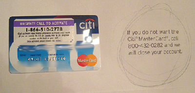
Ridiculous Credit Card offer

Permalink: Ridiculous_Credit_Card_offer.html
Words: 23
Location: Snyder, NY
Category: web design
10/03/07 10:03 - 66ºF - ID#41483
working on a table (html that is) site
Permalink: working_on_a_table_html_that_is_site.html
Words: 47
Location: Snyder, NY
10/01/07 10:50 - ID#41445
Need some cool mac apps and Sunday Sk8 s
Permalink: Need_some_cool_mac_apps_and_Sunday_Sk8_s.html
Words: 65
Location: Snyder, NY
09/27/07 07:29 - 64ºF - ID#41368
I hate QWERTY
Permalink: I_hate_QWERTY.html
Words: 96
Location: Snyder, NY
Author Info
empireoflight
![]()
Category Cloud
- User must have at least 3 blogs in one category for categories list to show.
More Entries
My Fav Posts
- This user has zero favorite blogs selected ;(

 mobile


I might switch to the white one, the only reason I wouldn't is that on a multipage pamphlet, the really black e causes the reader to stop on the page more than the white.
My idea was, they would be flipping, they see the black e. It forces tehm to stop on the page. THe uncenteredness makes them slightly uncomfotable, they following the direction of the uncentereness up and end up at the logo. Plus the uncenteredness makes it pop out in a slightly 3d fashion.
I think in general no matter what people will look at the page though because you should see the other adverts. They are very businesscardesque. I will post some exmaples from the 2006 pamphlet tonight.