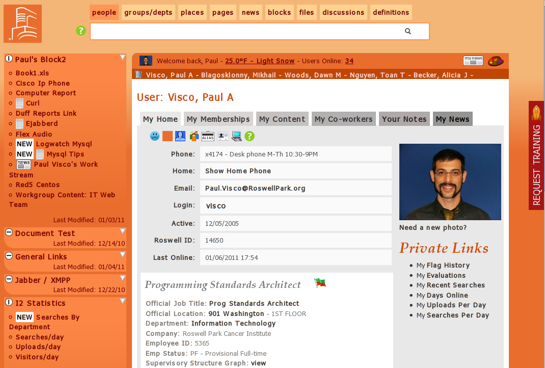
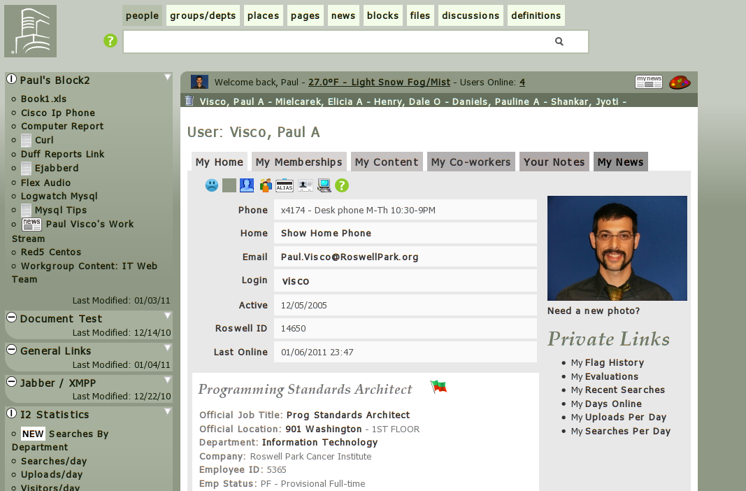
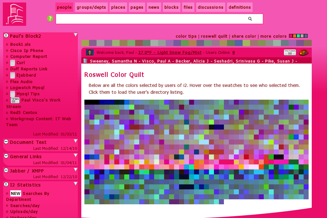
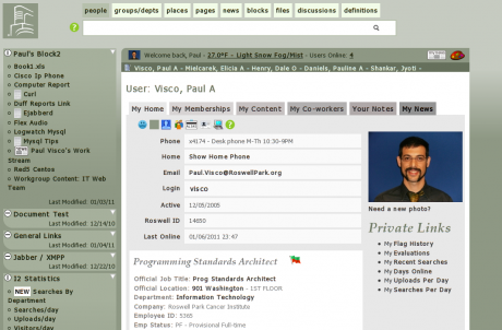
At work I designed and programmed the new intranet over the last year. Instead of jamming a color scheme down people's throats I decided to let people choose there own color and then created a formula to scheme from there.
People seem to like it because out of the ~1,500 people that use a computer each day, almost 1,000 chose a color.
You would be surprised at how many people pick hot pink/peach and bright oranges. There are even a few hot sea foam greens. To be fair there are many more woman, but even some guys have pinks and purples.
Its funny because the corporate push/marketing designers would be for corporate blues and boring greys but clearly, the people voting with colors picked much brighter hues.
This fire orange, I copied from
(e:tinypliny) who had it for a while.
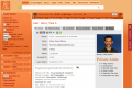
The saturated areas are the parts you kind of ignore, like you links to most used content, etc. The white space is then focused on things like the search and content areas.
You can pick pastels too but I really like the bright colors.
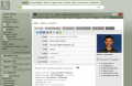
Each one of those dots on the quilt represent a color swatch that people chose. The color scheme is from one of the users.

Today the videographer told me that my work is ugly because I am not a designer. Ugly is so subjective. The ironic part is I actually have an MFA in computer media studies. I wonder if he does?


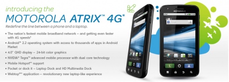
 It has a dual processor, and a webtop accessory that lets the phone become a netbook. I hope it is available by my birthday but I doubt it.
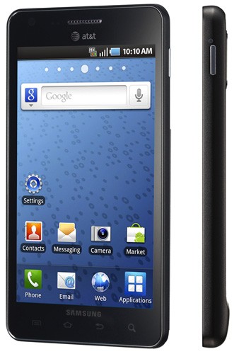
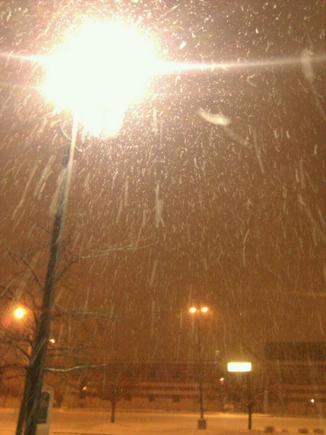
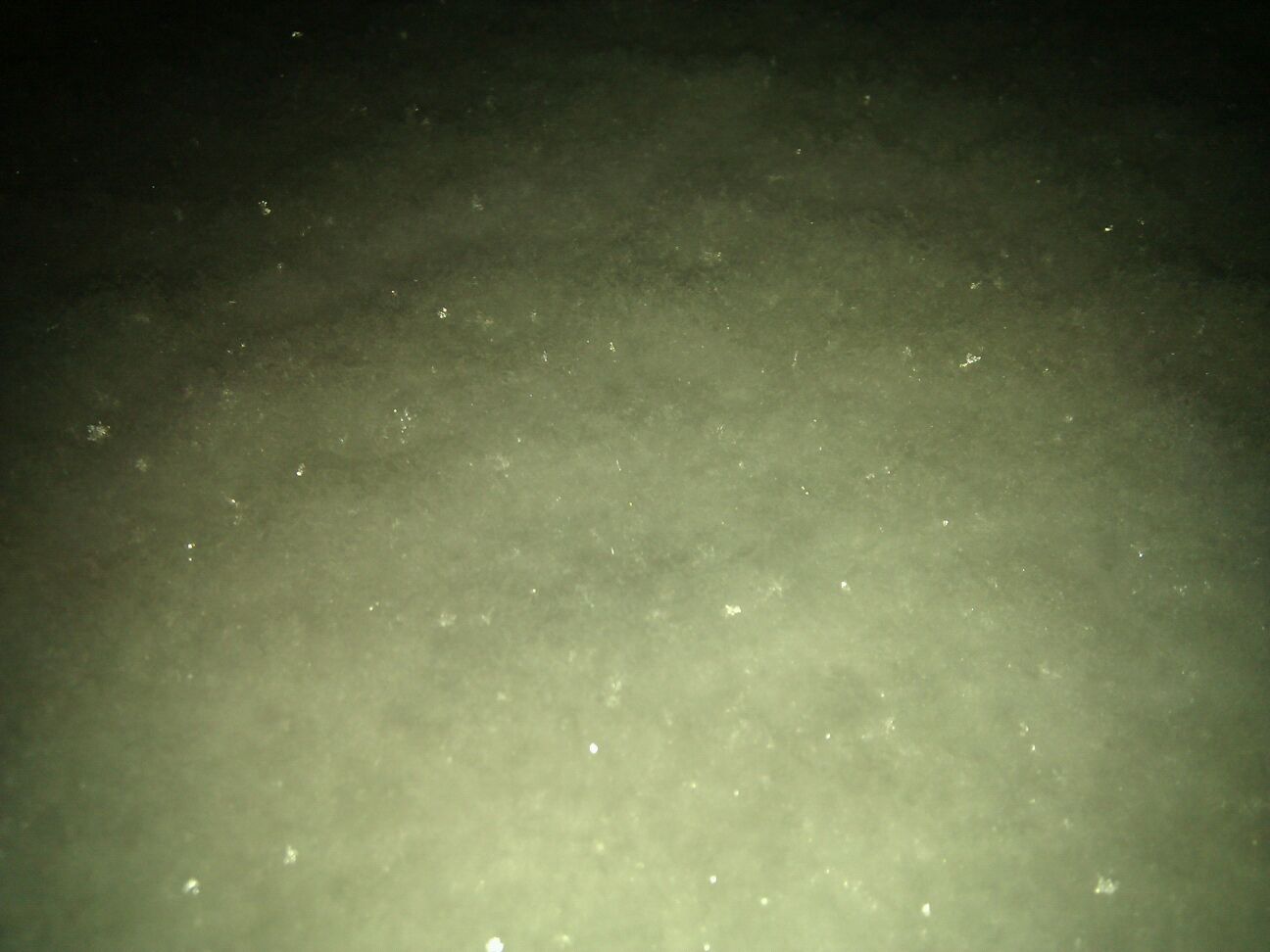
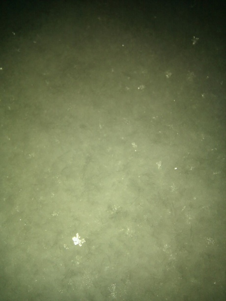
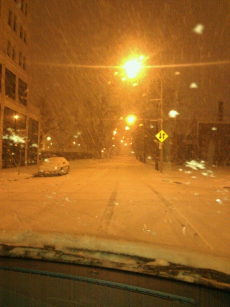
Snow With a flash is tough to shoot, you really have to be at pro level not sure about with a phone though. Since the flash hits the snow in mid air it looks wacky then in the dark it is hard to see the snow.......
I was fascinated and for the first time free-fell on some of the pavement snow. It felt awesome. (I kind of wished I had more muscle because all the bones impacted at the end of the free-fall, but it was great) and scared some people who were walking on the other side of the road.
like glitter from the sky!