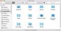
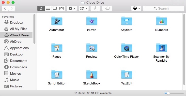
The new OS X is so horrible looking. They tried to flatten it but left half the icons 3d. Now they show up as 3d on flat folders. And what about the horrible blue they chose for folders. I can't help but feel I'm looking at Linux KDE 2003.
If you have it, open up system preferences and compare the icons.


LOL, who needs these when you have a terminal?!