Journaling on estrip is easy and free. sign up here

Paul's Journal

paul
My Podcast Link

10/24/2014 23:50 #59506

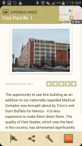
Trico Building and Google Fieldtrip
Category: google

Who edits these texts? This seems so biased.
image

10/24/2014 23:47 #59505

Feminine candy
Category: food

Marketing at its finest.

image

10/19/2014 17:09 #59502

Prantl's Bakery
Category: food
Was thinking about German cremehorns which lead me to search for the best bakery in Pittsburgh which led me to Prantl 's in shadyside. The market square location was already closed for the day.
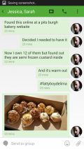
I ended up buying 12 of these almond creme things but they are so freaking good. I wish (e:hodown) and (e:lilho) could have been there with me.

image

image

image

paul - 10/21/14 23:57
No we went to the bakery.
tinypliny - 10/20/14 21:59
Wait you ordered these online?!
tinypliny - 10/20/14 14:01
WHOA! I want those!

10/19/2014 12:21 #59501

Party In Pittsburgh
Category: pittsburgh
It seems like Pittsburgh is way more fun than buffalo. I still want to live here.

We went out on a crazy dance night in the city. From Tuneyards at Mr. Smalls to strippers at Real Luck Cafe to a hidden straight warehouse dance party called hot mass in a gay bathhouse. The Dj Theo Parrish frkm detroit was amazing. I want to go back on the gay night called Honcho.
image

When we were at Hot Mass we got to meet Aaron Clark who (e:Joe) and I agreed is the best smelling man we have ever smelled. Here is his interview about honcho in butt magazine

image

Buffalo is so small that I met a guy in Pittsburgh who asked me where I am from, and when I told him, he listed off the one person he knew from Buffalo - and we knew him. IT was Ginger Joe. What are the chances?

image

image

image

image

image

image


vincent - 10/20/14 00:18
Pittsburgh is Buffalo if it played their cards perfectly. It's sad that there isn't a sex positive establishment in Buffalo for over a decade. Come on isn't isn't Pittsburgh just as Catholic as Buffalo?

10/19/2014 12:06 #59495

OS X Yosemite Design
Category: design
The new OS X is so horrible looking. They tried to flatten it but left half the icons 3d. Now they show up as 3d on flat folders. And what about the horrible blue they chose for folders. I can't help but feel I'm looking at Linux KDE 2003.

If you have it, open up system preferences and compare the icons.


image
tinypliny - 10/20/14 14:03
LOL, who needs these when you have a terminal?!