Journaling on estrip is easy and free. sign up here

Tinypliny's Journal

tinypliny
My Podcast Link

08/11/2011 13:22 #54922

I'm Imelda.
Category: the odes
I have 25 pairs of footwear. I don't have a picture right now because they are not all together but I will post them here someday.

Flips Flops = 5
  • Black (my latest, one of my awesome colleagues at work bought these and they were too small for her. But she thought of me before returning them! They fit me like those glass slippers fit Cinderella. Only, they are 1000x times more comfy.)
  • Black with red highlights: From Chandni Chowk, Old Delhi. Just as crazy and just as cool.
  • Blue beachy. I got these in Florida for $2. I was in Florida and I wasn't prepared for the beach!
  • Orange Orange: I was in California and my shoes got squelchy from a massive downpour. We were near an Old Navy. $3.
  • Chinese traditional knockoff: I loved the embroidery and the silk and the blingy fake stones. Washington, DC. $2.

Everyday, no-thought-involved shoes = 2
  • Reds: Mary Jane sneakers. Love them. Alas they can't be worn in the winter. I love red shoes. I sometimes wish I could spray paint all my shoes red or orange or green or maybe a tasteful combo of all three colours. But can a red-orange-green combo be described as tasteful? Who knows.
  • Winter boots: Wore these for 5 months straight earlier this year and last year. Workhorse of a shoe. Don't look too dressed down either. But best of all, they are light enough that they don't feel like a chore to walk in.


Sneakers = 7
  • Sporty Bright white and blue: These are big at size 7.0. A whole size up from my regular feet size (which ranges from 5.5 to 6.5). But they are light and comfortable and I have danced and worked out in them. Not a big fan of how they look. They just look too sporty. They might as well have "SPORTS" flashing in neon all over them just like that sign that flashes " BOWLING" on Amherst and Elmwood.
  • The 8:20s/Grey and orange: I bought these for $8.20 with tax. I remember because when I checked out of the store it was 8:20 PM (it said so on the receipt) and it was the 20th of August around 5 years back. I love these and they are almost worn out now. I live in constant fear of when they are going to split into half or some such hideous fraction.
  • Greens and Whites: From home. The store clerk who fitted these shoes for me at the store stalked me across Connaught Place where I bought these. It didn't make any sense. I freaked out and took random routes to the car park to shake the trail. It was like a spy novel gone bad. They were my favourite in ROC. Don't wear them much because they are kind of worn out now. And not because the clerk was creepy.
  • Blues and Greys: From home. Comfy shoes. Wear them occasionally with all the other blues and greys that dominate my wardrobe. It is the perfect shoe that gels so well with everything else that sometimes people think they are part of my trousers. Well.. not really, but that part was fun to make up.
  • Spring Green Cloggy sneakers: love these and wear them often. I like that they are the green I like. But they are kind of heavy and clumsy and inflexible. I still like them but... You know, because there are always buts.
  • Grey and Grey: Okay kind of sneakers. I need to replace the laces. Neither loved nor hated. They look neutral too. They are the height-of-neutral shoes out of all my 25 pairs.
  • Brown and Greens: Wore this extensively everywhere. They are still going strong. Like them a lot. Occasionally grit gets into the weird elevated holes they have on the soles. Whoever thought that design up obviously was not thinking of me walking all over NYC and Florida and California and DC and Georgia and of course, Buffalo in them. Notice how I don't want to remember ROC in that list. I didn't particularly like anyone I met there except my landlady. I remember her telling me once that she liked these brown and green sneakers.


Casual work = 2
  • Brown Suede Oxfords: Comfy almost-office shoe for slightly chilly weather. They are so ordinary looking. Almost everyone has had a shoe like this, I am sure. But they are so soft and unassuming. Fun to wear.
  • Black square slip on: Comfy but I don't like how these look. They are too square. I simply don't need any more masculine accents in my wardrobe. For a while they were my dance shoe and the soles are still covered in Gaffer tape ((e:tinypliny,53404))


Office, currently under my workdesk = 2
  • Black heel boots: I wear wherever my feet land in the morning and sometimes they land in terribly casual ones. These are back-ups-immediate-dress-up-lethal-looking-heels. They are comfortable though. At 2.5 inch a bit high, but eminently manageable. They transform however shabby I am looking. I then just need to pull out an air of sophistication to complete the effect. Of course. I often fail there because I am not sure I have that air in me anyway.
  • Flowery brown hippie Mary Janes: Fun little mary janes. Dress up but casual. When they were new I had to treat their rims with coconut oil for an entire week to stop them from giving me shoe bites. It's so funny that no one knows the term "shoe bites" here. Yes. it's across-the-pond lingo for blisters caused by new shoes.

Pure Dance shoes = 2
  • Salsa Suedes: I loved the dance, once upon a time. Then something happened and I totally fell out with it. I can't say it was a specific something but more like a generally depressing helplessness-related something. I bet they are still awesome dancing shoes for hard surfaces. Maybe I just need to go dancing with (e:Paul) and learn some crazy moves. :)
  • Black swan: I like to call them that, but they are really quite plain split-sole white-suede-bottomed ballet shoes. The only thing that is rather odd about them is that they have a white suede bottom. Why on earth would anyone opt for white suede bottom. They attract and retain ALL the grime from whatever surface I am dancing in. It is as if they are snakecharming the dirt out of surfaces while I dance. Only they fit me like a glove and I can forget about my ballet teacher casting disapproving glances at my feet when I am wearing them.


2.5 inchers I intend wearing someday but haven't yet. = 3
  • Burgundy suede: My favourite 2.5 incher. I love the colour. I have a matching scarf. Definitely the ones for the big day whenever it comes around.
  • Brown fake crocodile: My least liked 2.5 incher. I bought this online. Big mistake. What in the world was I thinking. Not only do they give me shoe bites, they are also losing their gloss and get-up even though I have never worn them outside!
  • Shiny burgundy: An inbetween shoe... thinking of wearing these tomorrow, but afraid I may not look like me. But I should atleast give them a chance, right? I actually want to silence the heels with fake suede strips before I wear these or any of the heels really. The horsy clippetty-clop heel-clatter sounds so much like keyboard rackets sometimes. It makes me nuts having to listen to both of these.

Need to donate = 2
  • Blue heels: They are a size too big. I don't know what happened here. How did I end up getting these? My feet easily slide out of them all the time. I just can't wear them because they don't stay on. Maybe I don't know how to wear strapless heels because only the Mary Jane type of heels stay on my feet. I squarely assign the blame on the person who was with me when I bought these. I realize everyday that I don't like her so much. I don't know why I started hanging out with her in the first place. She always made me feel like crap. I don't have to deal with this anymore since she is not in Buffalo, but I still sometimes wonder how my life would have been different had I actively blocked any efforts by depressing fad-ridden people to become my friends in the first place.
  • Winter shoes: I bought these for my first winter in ROC. I wore them then but they are TOO HEAVY. When I wore them it always felt like I had loads attached to my feet when I walked. In fact that was the reason I never wore them much and ended up ruining several of my 7 sneakers with the salt and snow before I realized that I really needed a proper winter shoe that I could wear without thinking and weighing the pros and cons. My current much lighter and waaaaaay more useful winter boots replaced these. These need to go. They are in perfect shape, but just not for me.


I never throw out my shoes. Maybe I need to start with the old heavy winter ones above that I am never likely to wear anymore and the blue heels that are a size too big.

I know that some people don't have any shoes to wear in this world. But then they also probably don't have any food to eat, any dress to wear, any phd to finish, any friends to hang out with, any dance class to passionately dance in, any snow to deal with, any too-dressy slightly strange non-primary intimidating advisors to contend with... or even much of estrogen.

Why did I get those 2.5 inchers? I wear them around the kitchen because the counter and sink and stove are too high for me. I could easily pull them off for 8 hours straight without whining but that's not the point. They are ridiculous. The point is it is tough to defend the shoes you own or don't own. They are sometimes necessities but they are sometimes frivolities as well. I guess a part of Imelda lives on in everyone; some have more of her than others and she is hard to evict.
leetee - 08/12/11 10:42
Oh my. If you are Imelda.... then who am i? My last Converse Count was nearing 70. *hides face in shame*
tinypliny - 08/11/11 23:10
hehe, yeah, I never feel like I should make my feet suffer. Walking is my primary means of transport. Considering what people spend on fancy cars, this is nothing at all. My priority is always shoes that don't make me feel like I don't want to walk. That would be a disaster for me. I like things to look nice as well... but sometimes these two objectives don't always line up (eg. in the case of heels). Whatever I do, it's impossible for me prance around in any sort of heels after a maximum of 09 hours. I kept track.
paul - 08/11/11 22:00
And I thought I had a problem at 14, lol.

Lets dress up fancy for diner some time so you can use the heels. Shoes clearly have different purposes. As the item that gets most impact it makes sense to have a bunch. I mean you could live with one teeshirt, one sweater, and one pair of jeans but who wants to suffer for no reason.
heidi - 08/11/11 17:42
"Shoe bites" is a wonderful term.

08/11/2011 12:03 #54921

Lindt & Sprüngli Chocolate
Category: eating out
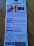
I don't know what was the %cocoa in the Lindt chocolate (e:Paul,54915) posted but I don't get why they decided to change their simple uncomplicated old recipe in all the other bars except the 85% (and possibly 90%) to include palm oil, soy lecithin etc. Why weren't the ingredients below that work SO well enough?

image
paul - 08/12/11 01:31
I did not buy it because of the nutritional profile.
tinypliny - 08/11/11 23:12
Ah, anyway, the substitutes gross me out. I really don't like it when oil goes in instead of butter or cocoa butter. Somehow it seems like the chocolate has been made... less.
paul - 08/11/11 22:02
That bar I posted was not a regular bar. It was a dark chocolate bar stuffed with truffle filling.
metalpeter - 08/11/11 17:19
I have no idea..... Wasn't there some supposed shortage some time ago something with bad crops and prices where supposed to sore maybe that was a factor..... Guessing that with all the different brands of "The Fancy" stuff they want to change things up or get FANCIER or what ever?

08/08/2011 20:38 #54907

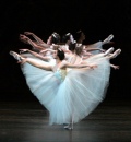
Back from ballet
Category: dance
I needed a hardcore workout today to channel all that excess nervous energy. Quite luckily Kolleen emailed me right when I was thinking about going to her class.
image
I was soaking wet by the time we were done and far away from anything resembling graceful but I had a bunch of fun.

They have a African Movement Workshop on Wednesday. I know it conflicts with yoga, but is anyone interested in going with me? It's $12.50 for the evening if we turn up to the class together.
tinypliny - 08/11/11 23:06
lol
paul - 08/11/11 22:03
Unless there is a lime green one.
paul - 08/11/11 22:02
She is definately the black swan.
metalpeter - 08/10/11 17:14
So are you the White Swan or the Black Swan ? Kidding never saw that movie but yeah Ballet is intense (Never done it ) with being on toes and leaps and landing and.........

08/07/2011 20:17 #54901

View from 9th Avenue
Category: science
This classic cartoon by Steinberg could easily be titled:
"View with a limited dataset".
image

Or maybe.
Who cares?!

08/07/2011 16:24 #54900

Being intuitive
Category: the odes
in·tu·i·tion/ˌint(y)o͞oˈiSHən/Noun

1. The ability to understand something immediately, without the need for conscious reasoning.
2. A thing that one knows or considers likely from instinctive feeling rather than conscious reasoning.


Is it bad to require that people use their conscious reasoning at least some of the time? Or does having this requirement imply that the method put forward to explain things is not clear enough?

Conscious reasoning is clearly, more effort than intuition. Where do you draw the line at slaving over keeping everything super-easy and "intuitive" and requiring at least some effort on the part of your audience or end-user? Could not slaving over providing "intuitive understanding" to your audience a sign of laziness or worse, reflective of your imperfect understanding of the system or the subject matter? I wonder...

tinypliny - 08/07/11 20:05
I am glad you wrote that bit about "essential complexity". It translated SO WELL to what I was wondering about. The challenge now is to determine where the essential complexity lies. I am very unsure of whether I understand if I am capable enough of assigning this complexity.

I am constantly worried that I might expand on relatively simple things and gloss over complex things that really require more detailed analyses, thought and interpretation. It is directly related to the question, what is my central concern and objective when I look at this data? Am I presenting enough objective details to let my audience reach their own conclusions without relying too much on what are "known" facts or their intuitions (all of us make intuitive judgments about associations in data especially in medicine, for eg. oh, smoking must be always associated with everything bad. Oh, fat is always the worst part of the diet. etc. etc.) So the concept essential complexity comes in when you force people to take that extra effort to look at data in a different way and possibly take away some more clarity and objectivity in how they think about associations. That is the job of a well-oriented epidemiologist.

I don't know if I am there yet. So I find your insight fascinating and extremely pertinent.
jim - 08/07/11 19:53
Ah, I'm laughing at myself for reading so much of my own obsession into what you were describing that I made so many assumptions :)
tinypliny - 08/07/11 19:32
Wow. that was amazing! Thanks. :) Believe it or not, I was not thinking about UIs at all. I was thinking about how best to present my findings at tomorrow's meeting with my advisor! I was thinking should I go all graphical or pages and pages of numerical data. I think I am shifting more and more towards a graphical view with numbers for only the nastier details.

I actually do agree with you a lot. The essential aim of any design should be getting out of the way and letting the use concentrate easily on the job at hand and getting it done rather that worrying about how it is going to be done and wasting time by tweaking the workflow of that job. your analogy of the rock as a unintuitive hammer is spot on. I think I might use that someday (and thank you in my mind!) :)

I want to come back and read that many times more to pick on more details. On the whole I think this is where Linux is faaar behind Macs or even windows. It's not user-friendly and makes you think TOO much about the mechanics and less about getting stuff done - at least in my case, as you probably noticed in my tangential linux post. I never thought like that when I was unconsciously on windows. I never once wondered about what libraries I would need or "compiling" source codes or back-ward compatibility or backporting or even component crashes. Now all these things are in my subconscious as I experience quirk after quirk on this OS. It is interesting but sometime annoying as well...
Do I have a choice? Unfortunately, it doesn't seem like it.
jim - 08/07/11 18:41
I think about this all the time, it's basically the focus of my career.

I'm not disagreeing with what I think you're getting at, which is that we have to use our minds and not mindlessly click through software wizards.

I am disagreeing with the implication of your question, which I read as that UI design strives to remove the need to pay attention when instead it tries to direct it. And I'm also explaining my thought processes as I do this work.

Tools exist to allow a user to do something that they care about, and should only insist on as much attention and concern about the tool itself as is minimally needed in order to solve the user's problem. A UI designer's responsibility is to guide the user in such a way that their valuable and limited attention is spent in areas that a user is most likely to actually mean to spend it to accomplish something.

It's a combination of being consistent in how you construct things and providing coherency in how you align related concepts. Things that are alike should look alike. Things that are different should look different.

It's being novel only when you have a novel problem to solve, and not reinventing the wheel poorly at every opportunity when a more familiar solution would be kinder to the user.

It's stepping back and looking at how everything fits together, and preemptively solving as many possible misunderstandings as possible, to reduce frustration and error.

Everything about creating the right mix of these techniques is a judgement call about who your audience is, how often they use the tool, and what the consequences for screwing up are. UI for a web site is different from UI for a microwave, or from a programmer's build script.

Example: A hammer with a poor handle (uncomfortable to hold) might make a carpenter think more consciously about how is holding it, but does it really make him any more attentive to his actual job at hand (which is constructing a wall that is straight and sturdy)? A rock off the ground is just an "unintuitive" hammer.

Example: most unix commands provide options prefixed by a dash. But "dd" uses a totally different style, with name value pairs separated by an =. It's a block level file copy program, rarely used, and yet it's got a unique interface that's easy to screw up.

Example: hyperlinks. In 99.9% of web browsing, it's always safe to click a link (you can always go back). Sometimes web apps will have a link to delete something, instead of a button. If you're making a page, and you want to be sure a user thinks through the consequences of clicking on something, you make it a button. Most users have never consciously thought through this difference, but if you ask them about it, they immediately understand what you mean.

A way to distill this is to look at a problem and think, "What is the essential complexity?" A well designed interface will downplay or hide inessential complexity, and clarify the essential. The user is presumed to care about only the essential complexity.

For an MP3 converter, the essential complexity is merely choosing the songs to convert.

For a pilot, the essential complexity is managing a wide array of information and making holistic decisions, not consciously figuring out the how and why of a million gauges at once. That's why the gauges and units of those gauges are standardized and honed with almost a century's experience to provide information as clearly as possible. They can be read without any conscious effort at decipherment.

The UI designer whose work is least noticed is probably doing the best job possible.

This was fun to write up, thanks for bringing up the topic :)